JUMP TO TOPIC
Column Graph|Definition & Meaning
Definition
A column graph is a graph that displays categorical data in the form of bars or columns. Each bar represents a category in the set of data. This type of graph is usually named a bar graph. The graph’s height shows the frequency or quantity of the respective category while the width is kept constant.
Variants of Column Graph
Column graphs have multiple variants depending on the data type and its analysis. Some are designed to deal with multivariable data sets and others for single-variable data.
Clustered Column Graph
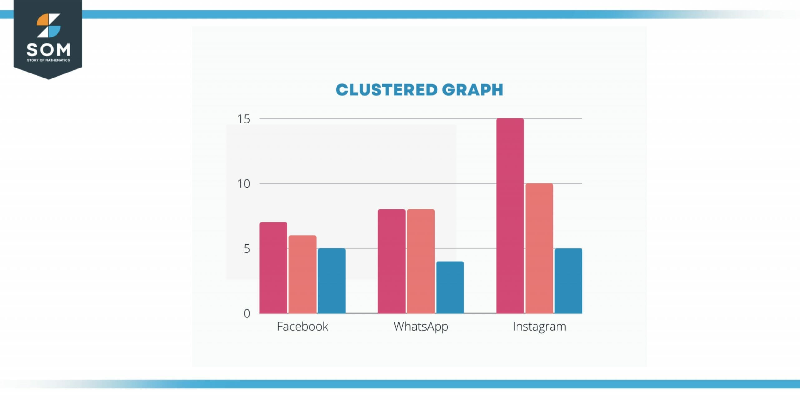
Figure 1 – Clustered graph with data categories in the form of clusters are shown which are actually different variables in a single category.
Clustered Column graph represents the data in the form of clusters which are actually different variables in a single category.
For example, if data is for use of social media applications Facebook, WhatsApp, and Instagram. The data is collected from the students of four different universities, so in the graphical chart, the data for each university can be represented in the form of a cluster for analysis.
For such data representation Clustered Column Graphs are used.
Stacked Column Graph
A stacked Colum graph represents data in the form of several column series stacked vertically, on one another. The more the value in each data time, the more the length of each series in the column will be. These graphs help in the simultaneous observation of several variables and their sum.
For example, a data set comprising marks of 5 students in two subjects, maths, and physics, can be represented in a stacked column graph/chart. The length of the legend in each column will show the marks in each subject of one student and similarly, other columns will show the marks of other students.
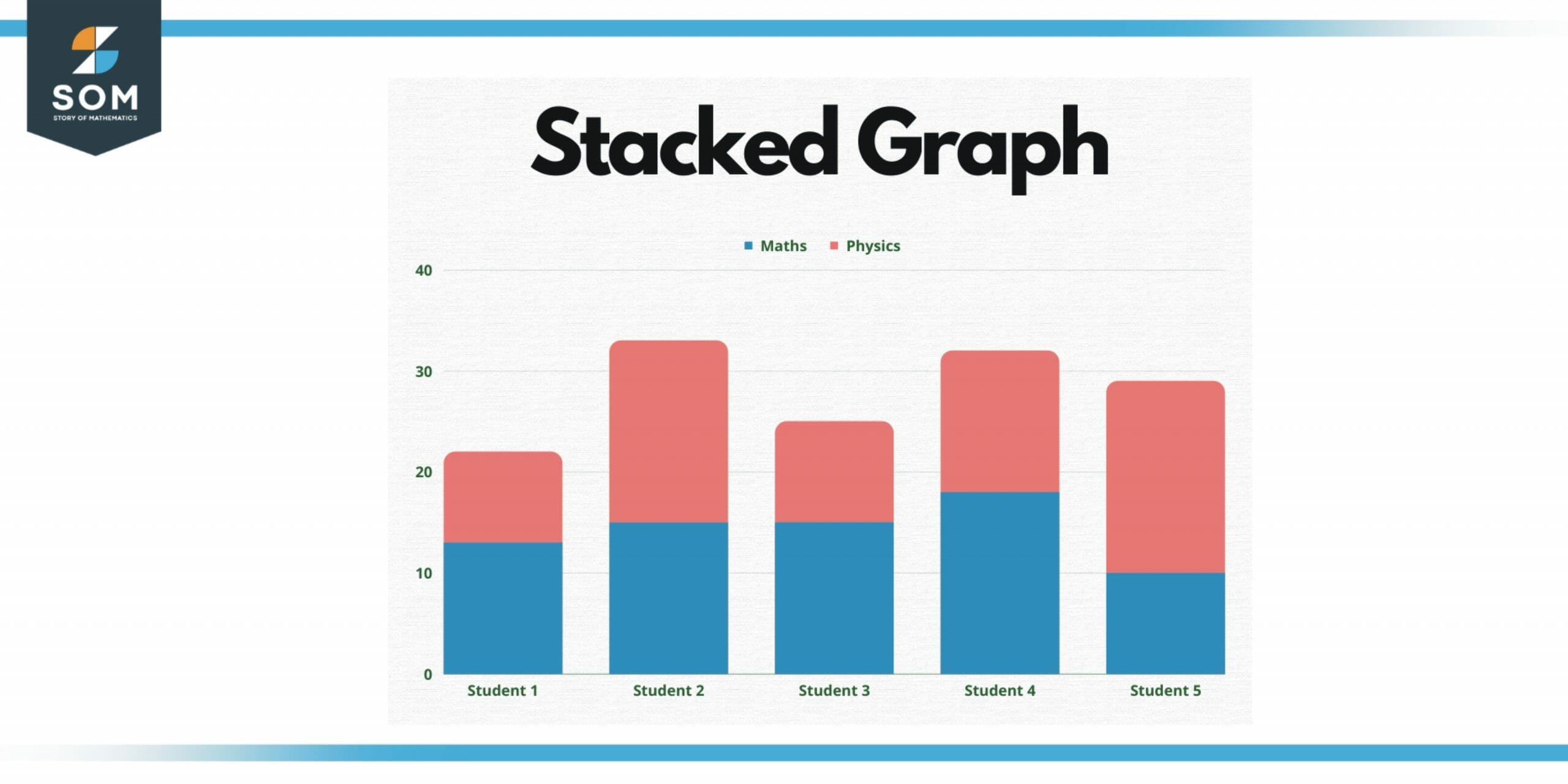
Figure 2 – Stacked Graph with several column series stacked vertically, on one another.
Such representation makes it easy to compare the marks of students in different subjects simultaneously. These representations are done by using a stacked column graph.
Small Multiples Column Graph
Small Multiples Column Chart is the type of column chart that visualizes multiple charts arranged in a grid or graph. This type of representation makes the comparison of the entirety of data elementary and easy. Some other names for this are lattice charts, trellis charts, panel charts, and, grid charts.
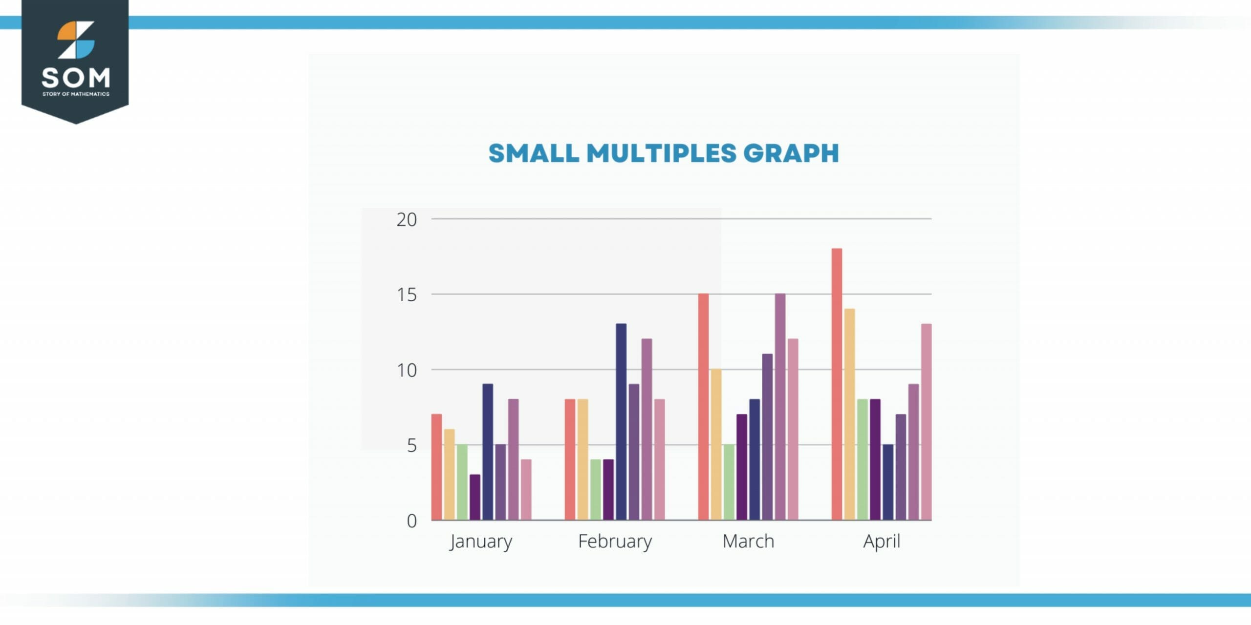
Figure 3 – Small multiples graph visualizes multiple charts arranged in a grid or graph.
Bar Charts
Usually, column charts and bar charts are considered the same but some scholars propose a difference between the two. According to them if the columns of the column chart are rotated 90 degrees and data is represented by the width of columns then such charts are known as bar graphs.
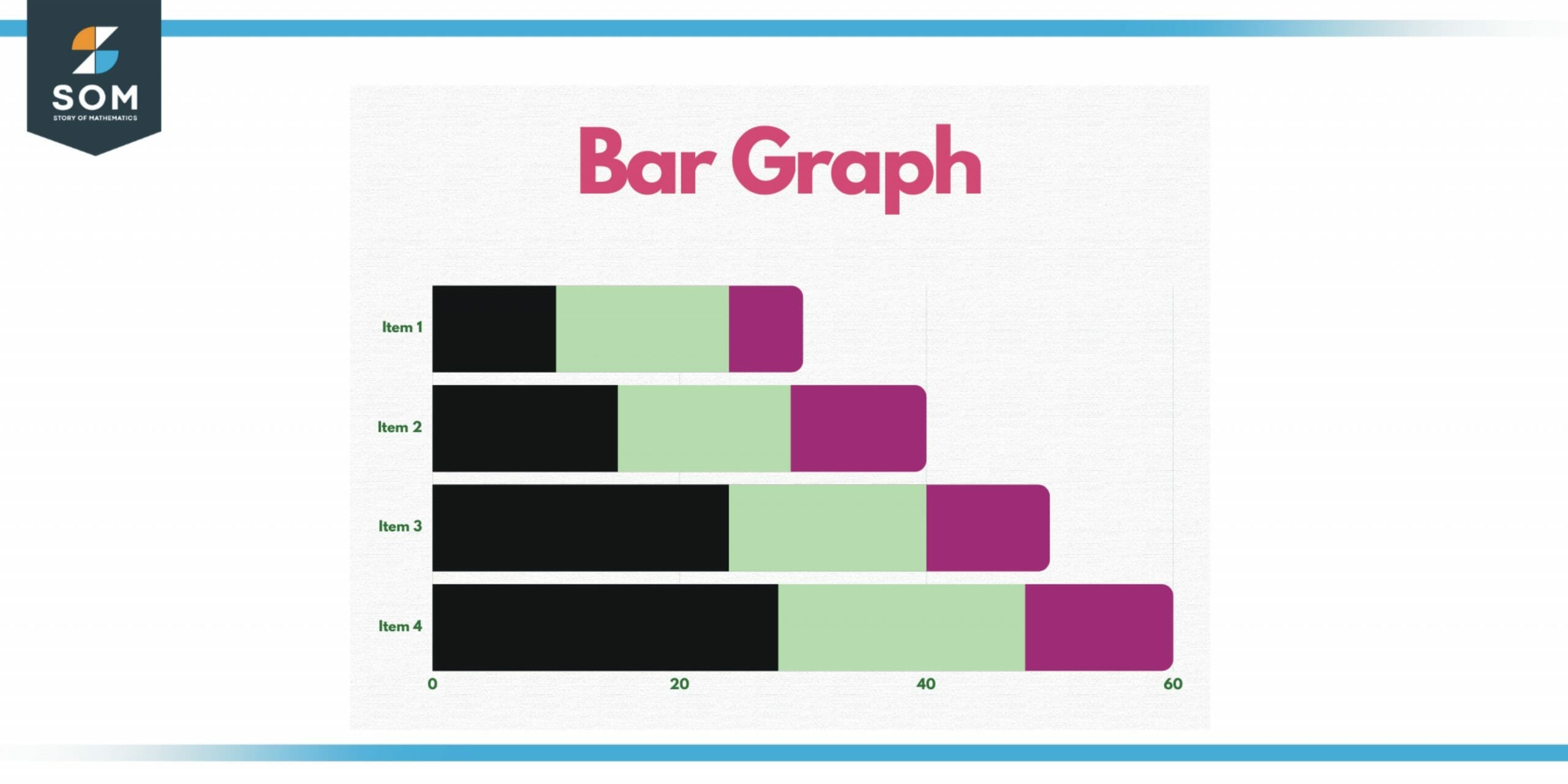
Figure 4 – Bar graph where data is represented by the width of columns.
For example, the rating of different TV shows can be represented using a bar chart. The width of the columns represents the rating of each show in its respective color.
Pictogram Column Chart
A Pictogram Column chart is also a type of column chart that uses images or pictures to represent a set of data. The difference between a Column chart and a pictogram chart is that in a pictogram chart pictures are used in columns for data representation.
Parts of Column Graph
A column graph has mainly four main parts. The first one is the Title of the graph. This elaborates on the information and data that the graph is presenting to the reader or analyst. The title is usually mentioned at the top of the graph.
Nex part is the Labels of the graph. The labels are shown on both the axis of the graph i.e. x-axis and the y-axis. These labels show what the x-axis and the y-axis represent in the graph. Usually, the independent values are written on the x-axis and the dependent are written on the y-axis.
Another important part is the scales used in the graph. Scales actually represent the units being used in the graph for data representation. On the y-axis, the scale number increases from the origin to the top. The increment of numbers is of the same amount on the axis. If a unit is set to five then each increment will be 5 e.g. 5, 10, 15, 20…
The last important part of the column graph is its categories. The categories of the collection are represented by using rectangles. These rectangles look like the bars that are labeled. Each bar is labeled according to the assigned category.
When To Use the Column Graphs
Column graphs are commonly used to represent certain sets of data but in statistics, there are certain situations in which these charts are used. The reason for their common use is that the data can be displayed in an attractive manner to convey the information.
Column graphs can be used when the collected data has some clear different categories and each of these categories has a specific value. If you want to compare the values of data, these graphs can be useful.
The complex set of data can be simplified by using these column graphs. You might have to write a complete article if you want to explain the data without a graph.
Difference between Column Graph and Histogram
The main difference between a histogram and a column graph is that the column graph is used if the collected data has discrete categories while the histogram is used when the data is continuous.
Continuous data is the data that is measured not counted. For example, the height of persons can be measured but not counted on the other hand number of persons is counted, not measured.
Solved Example – Data for the Currency of Different Countries
An economy student is assigned a task to give a comparative analysis of the currencies of the world. What method will you recommend for data representation?
Countries: Pakistan, China, India, Japan, UK, USA
Currency Rate w.r.t USD: Pakistan 100 rupees, China 100 yuan, Japan 100 yen, UAE 100 dirham, Russia 100 riyal
Solution
The best method to represent data for such analysis will be a column graph. The x-axis of the column graph will represent the name of the country and on the y-axis, the currency of each country in dollars should be mentioned.
Firstly convert all the currencies into USD.
100 rupees = 0.45 $
100 yuan = 13.79 $
100 yen = 0.68 $
100 Dirham = 27.23 $
100 rubel= 1.64 $
Now, this data will be represented in a column graph.
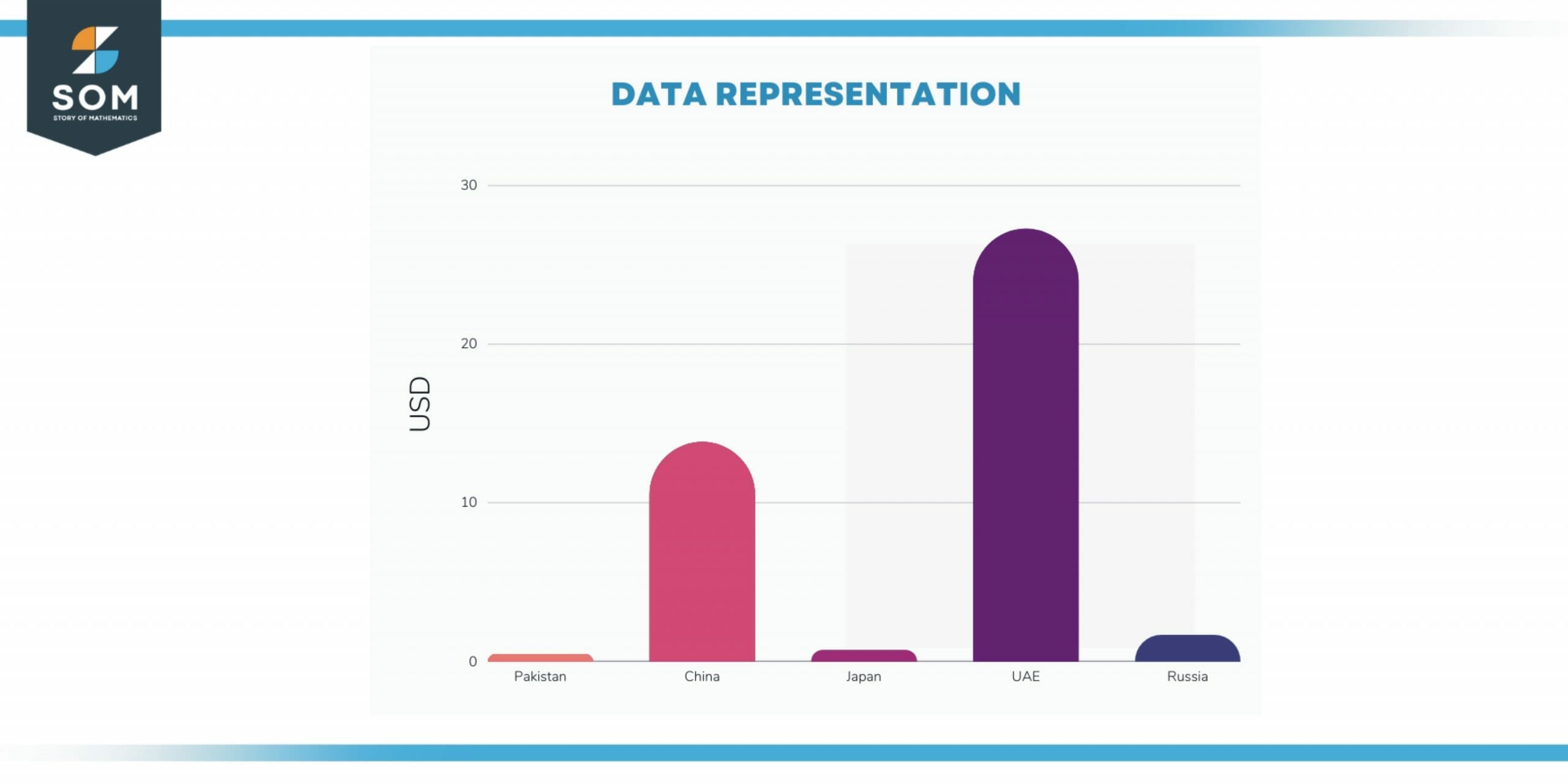
Figure 5 – Data representation for the example.
All images/mathematical drawings were created with GeoGebra.
